Salt Lake City, UT
250+
How to redesign a pivotal choice that decreases the drop off rate from the funnel.
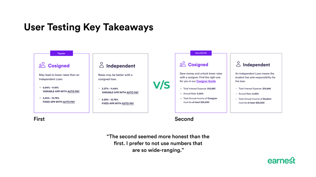
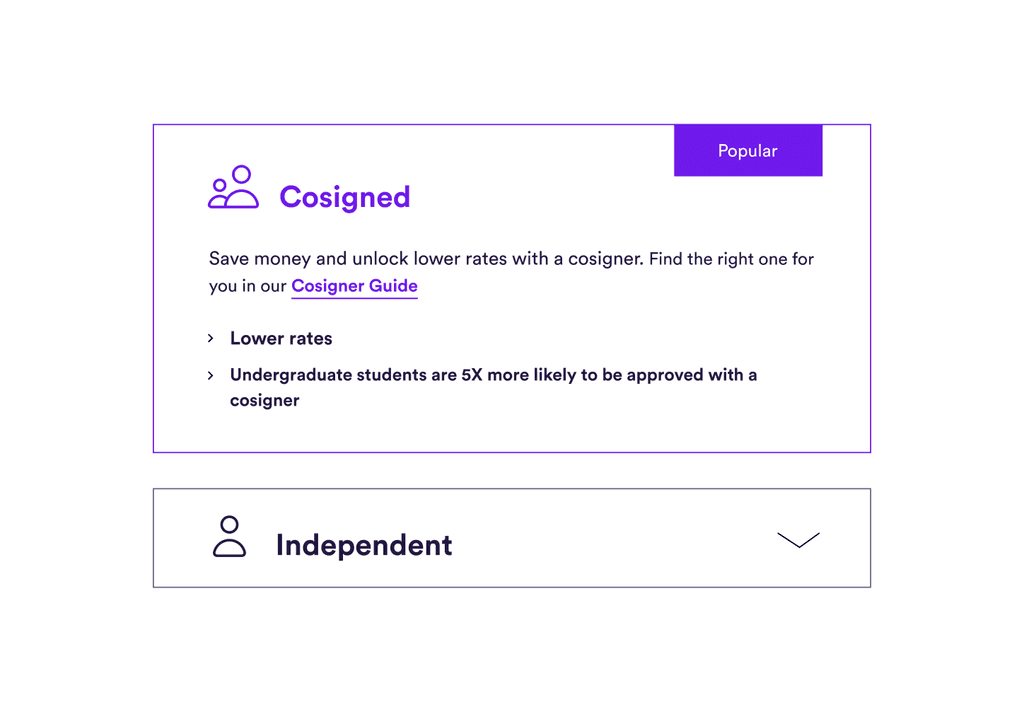
The redesign helped users to chose between independent vs cosigned loan with a confidence rate of 83% by presenting the key decision factors and removing ambiguity.
Conversion Rate Increase
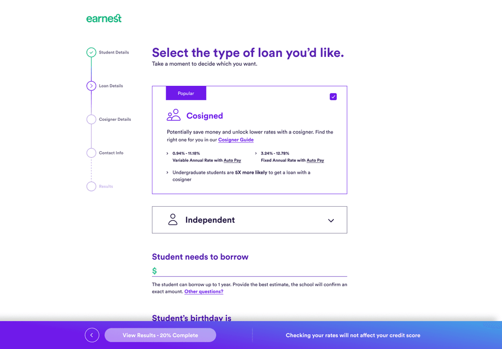
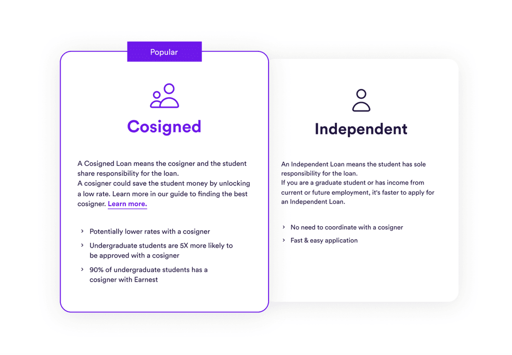
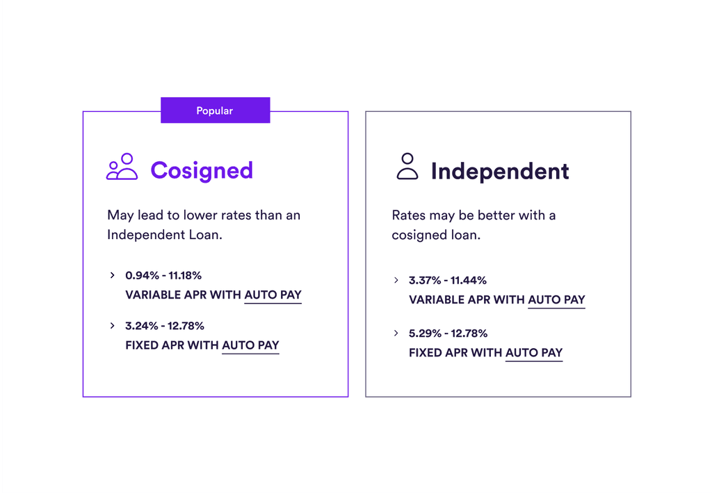
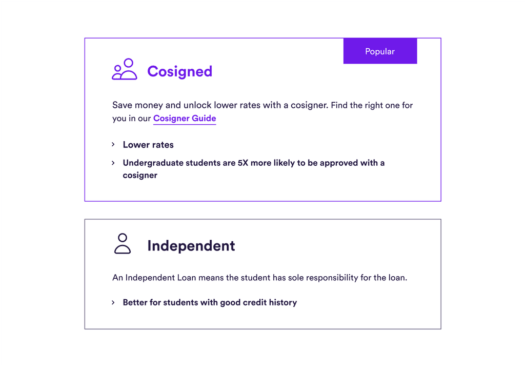
Final Designs
After the results from the A/B tests and some tweaks suggested by Product Managers, I worked very closely with front-end web developers to develop and ship these designs to our rate check feature.
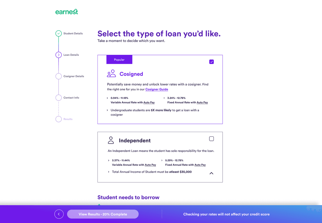
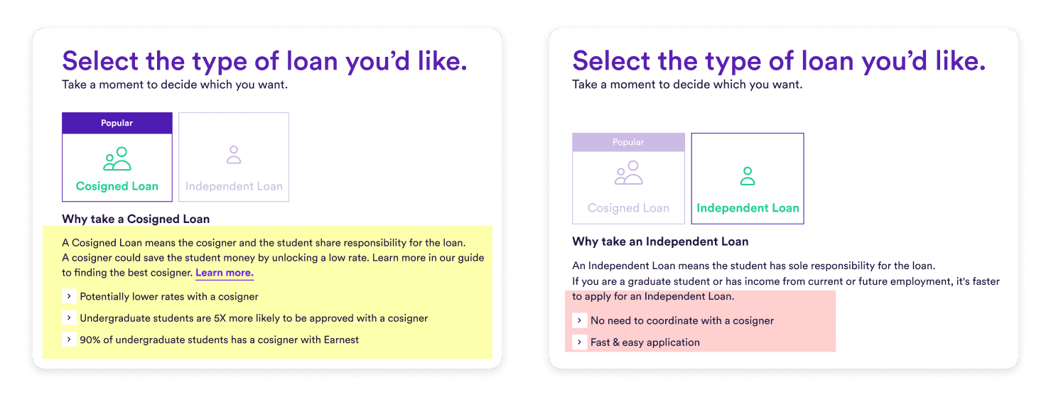
The current way of presenting the 2 loan choices is confusing, doesn’t display relevant information, and unintendedly convinces a type of user to select the wrong choice.
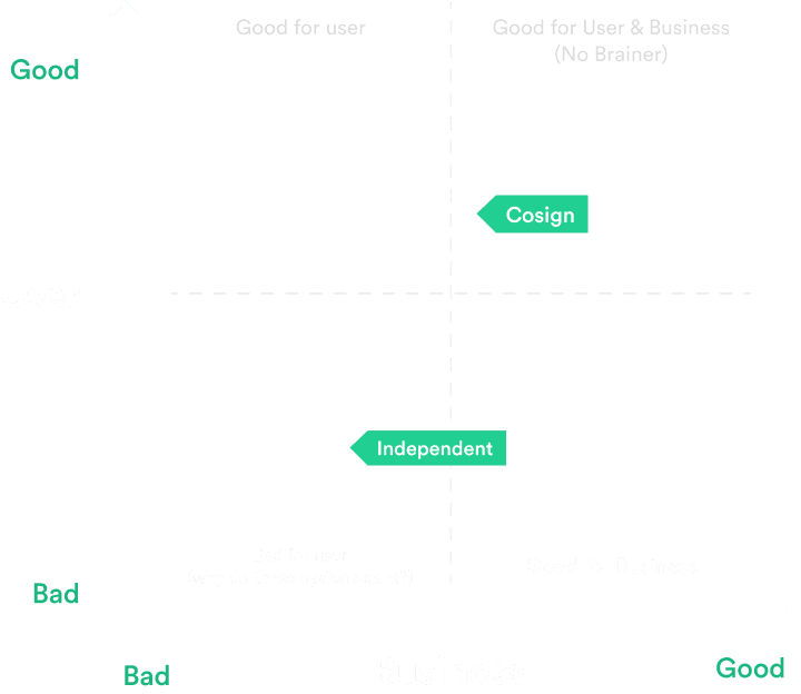
Establishing a Choice Outcome Matrix
To better understand the importance of the presented choices, I built out a choice outcome matrix, specific to undergraduates to build the perfect solution that is great for the users and the business.
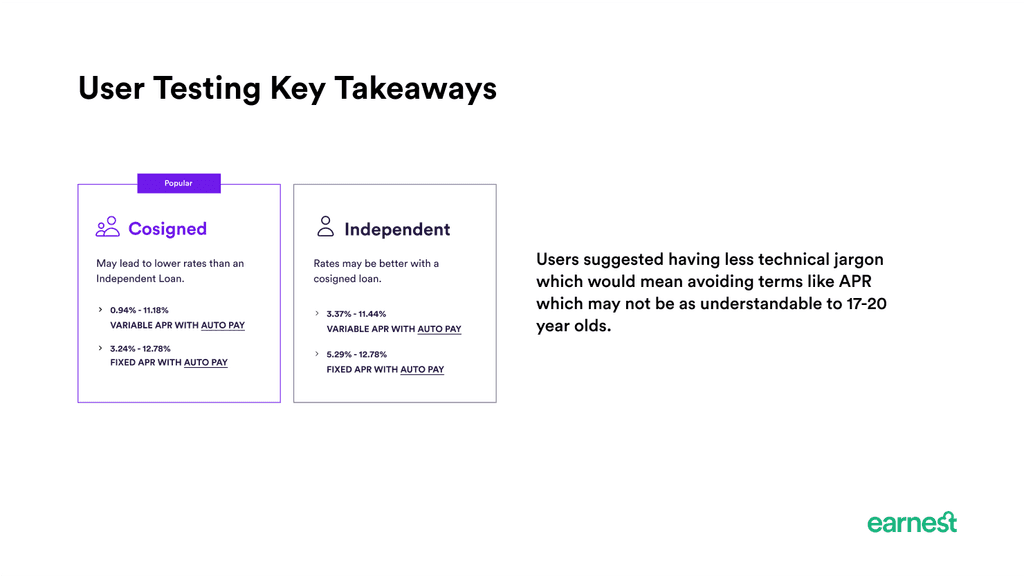
User Pain Points
No way of comparing the 2 options at the same time, user has to keep clicking between the 2 to arrive at a decision (early onset of user frustration)
Copy seems to nudge the user towards independent while the popular tag nudges cosigned which again causes unnecessary friction.
As undergraduates, users would love to take the “Fast and Easy Application with no need to coordinate with a cosigner” and 99% of the time will end up with no rates. While some users may just want to try it out for the sake of going through the app some may get discouraged from earnest and seek other options.
Solution Explorations
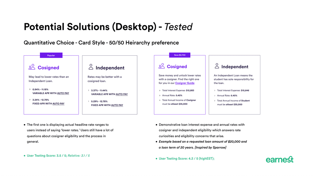
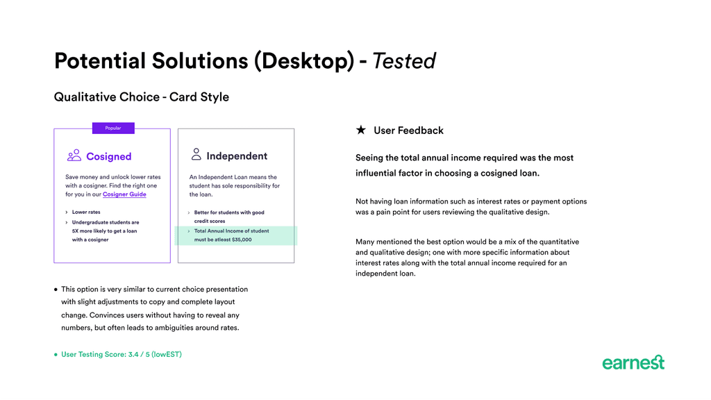
Solutions were critiqued based on development load (so trying to not make new design components) and was based on effectiveness in making the path of least resistance, but adding points of friction where we don’t want users to change their choice to reduce drop in the overall funnel.
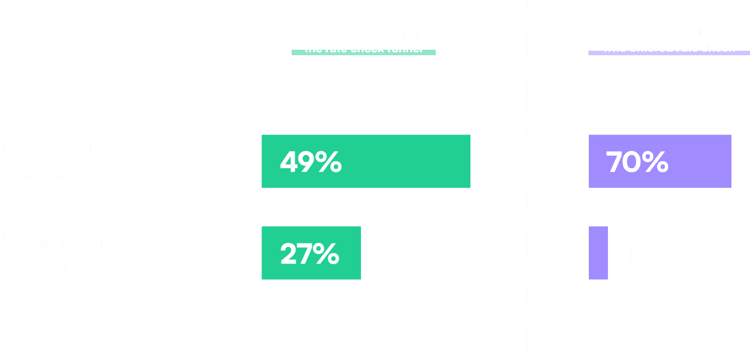
A/B Testing
I worked with the UX Research Lead to conduct an A/B test on 2 of the best explorations on UserTesting.com